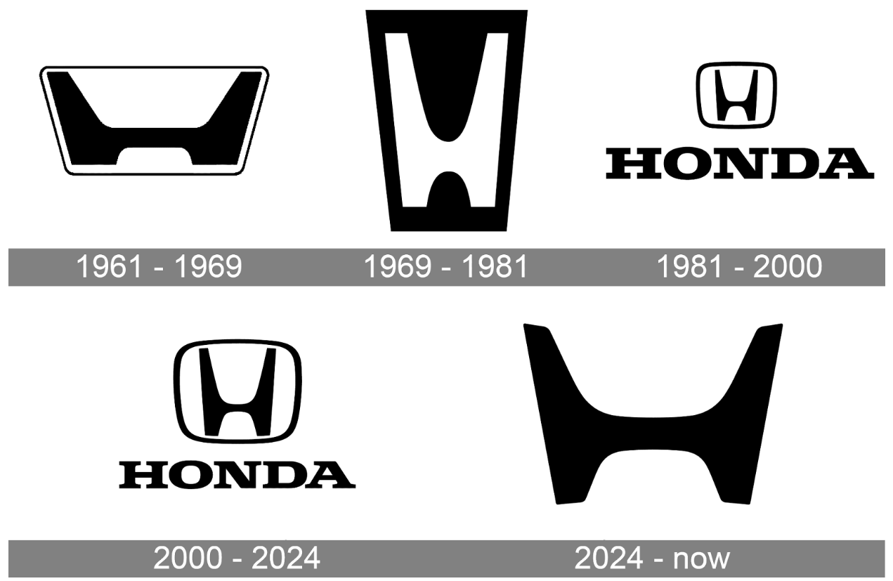
A Logo That Looks Back to Move Forward: Honda’s New “H”
After decades, Honda rolled out their exclusively EV line refreshed “H”, making it clear that this shift goes beyond design. Their updated logo isn’t a small visual tweak; it’s a clear message to the world, marking the beginning of a broader brand evolution. This shift matters not just to designers, or branding strategists but to anyone paying attention.
Two Hands, One Future: Design as Brand Strategy
Honda described the updated mark as “two outstretched hands,” a symbol of connection and forward movement. It suggests a brand that’s ready for change towards a new future while maintaining its roots.
The look feels modern, yet acts as a subtle throwback to Honda’s early logo heritage of the 1960s. Is this nostalgia or a strategic way to anchor new technologies?
A Small Change That Made Big Noise
Honda’s refreshed “H” demonstrates a key principle of modern logo redesign strategy: clarity scales better than complexity.
The change is subtle, but it shows how the brand is adjusting its identity for a more digital world, reinforcing a core truth of modern branding where simplicity signals intent and meaningful attention comes from aligning visuals with strategy and long-term business goals.
Heritage, Relevance, and the Power of Strategic Design
Honda’s logo rebranding move highlights an essential principle of branding: visual identity should be a reflection of strategy, not aesthetics alone.The updated logo aligns with the company’s broader transformation toward electric mobility, sustainability, and innovation.
It proves that when design decisions are rooted in purpose, they do more than refresh perception, they create meaning, invite dialogue, and strengthen long-term brand equity.
At Aimstyle, this is what we believe effective branding should do: honor where a brand comes from, while clearly articulating where it’s going.